How-To Guide
Which Instagram carousel templates and slide structures work best for brands?
Adapt slide-by-slide carousel templates for tutorials, comparisons, product details, stories and customer questions.
By the Superdirector editorial team. Revised November 9, 2026.
At a glance
Which Instagram carousel templates and slide structures work best for brands?
No template is proven best for every brand or goal. Match the sequence to the audience’s task: teach with steps, clarify a choice with a comparison, show relevant product details, tell a concise story, or answer a real customer question. Give every slide one role, substantiate claims, and review the post against the action it was meant to support.
- Choose the structure from the reader’s task, not a promise of guaranteed engagement.
- Use one clear idea per slide and one relevant next action.
- Review readability, contrast, image descriptions, and important text in the caption.
Choose the structure for the audience’s task
There is no evidence in the sources reviewed here that one Instagram carousel template works best for every brand. Start with the reader’s task instead. A person trying to do something needs ordered steps; someone weighing options needs a fair comparison; someone evaluating a product may need details and substantiated evidence. A short story or a set of direct answers may fit better when context or reassurance is the main need.
Think of a template as a reusable sequence of slide roles, not a guarantee of performance. For any structure, make the opening specific, give each slide a clear job, and end with one next step that follows naturally. Sprout Social’s carousel guide similarly recommends consistent visual elements and a distinct role for each slide; those are practical design recommendations, not proof that a particular sequence will outperform another.
| Audience task | Useful structure | Slide sequence to adapt |
|---|---|---|
| Learn a task | Tutorial | Task and prerequisites → steps → recap |
| Choose between options | Comparison | Decision question → criteria → trade-offs → fit |
| Understand a product | Product detail | Use case → feature → practical detail → next step |
| Understand what changed | Mini-story | Starting point → obstacle → response → lesson |
| Resolve uncertainty | Customer questions | Question → plain answer → useful context → where to learn more |
Treat these as starting points. The sequence should change if your audience’s question, available evidence, or intended action changes.
Turn the structure into a brief
Turn the chosen structure into a short brief before designing. State the reader’s task, the evidence or source needed for each claim, and the one next action. For a comparison, name fair criteria and meaningful trade-offs; for product details, verify the features; for a story, use real events and get permission before presenting someone’s experience as a testimonial.
Practitioner guides from Hootsuite and Sprout Social offer format ideas such as tutorials, product highlights, and behind-the-scenes content. Treat these as prompts, not proof that a format produces a particular result.
Give each slide a clear role
Sketch the sequence in plain text before designing it. A practical plan has four parts: an opening that identifies the topic or task, a middle that supplies the explanation in a sensible order, a takeaway that makes the useful point easy to revisit, and a final action related to the subject. Some carousels need only three parts; do not add a recap or a call to action if it contributes nothing.
- Opening: say what the carousel covers in concrete terms. Keep the promise within the evidence and content you can deliver.
- Orientation: give necessary context, such as who the advice is for or what the reader needs before starting.
- Development: give each slide one main idea. A comparison may put two sides on one slide when that makes the distinction clearer.
- Takeaway: collect the method, distinction, or next step in a form someone can use again.
- Close: ask for one reasonable action, such as trying a step or reading a relevant page. A request to save, comment, and click all at once can blur the purpose.
A consistent palette, typography, layout, and visual treatment can help the slides feel related, as described in Sprout Social’s template guidance. Consistency should serve comprehension: do not force a recurring decoration onto a slide where it makes the content harder to read.
Work through a hypothetical example
The following is a fictional hypothetical example, not a real organization, customer story, or performance claim. A community garden wants to explain how a newcomer can prepare for a volunteer orientation. The example shows a simple information sequence, not a real garden’s requirements or a promise about participation.
| Slide | Role | Draft content |
|---|---|---|
| 1 | Name the task | New to the garden? Here’s how to prepare for orientation |
| 2 | Set expectations | An orientation is a chance to learn about the garden |
| 3 | Prepare a question | Write down one thing you’d like to learn |
| 4 | Check the details | Confirm the time and location with the garden |
| 5 | Offer a next step | Contact the garden to ask about orientation |
The garden, its orientation, and these details are invented for illustration; do not present them as verified facts about a real organization. Before adapting the draft, confirm the organization’s actual process, time, and location. The final slide offers one practical action without claiming that an orientation is available.
For a product comparison, the same planning method would start with the buyer’s decision, name the criteria, and show where each option fits. For a story, it would start with a real, permissioned account and a specific lesson. The format changes; the requirement to make the sequence useful and truthful does not.
When enlarged, scroll horizontally to read the diagram.
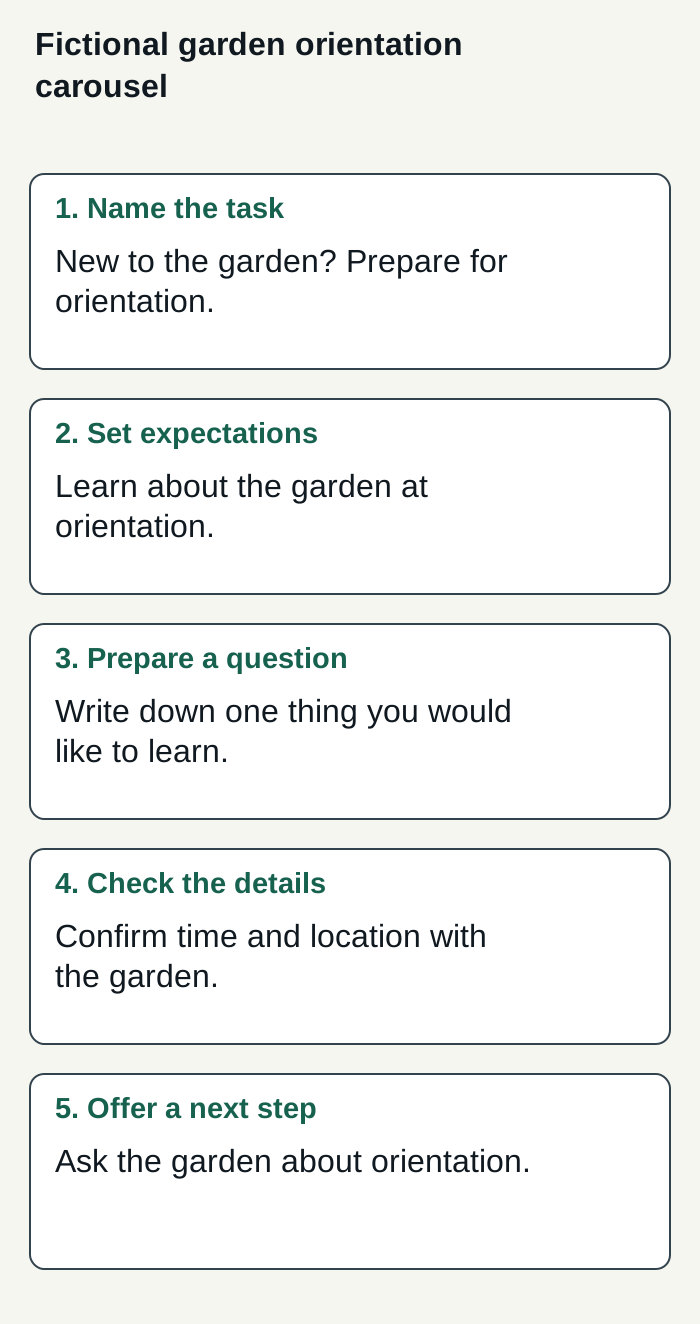
Original five-slide illustration for a fictional community garden. Confirm the real organization’s process before adapting; no event, customer or result is represented.
Condensed original editorial illustration. Read the surrounding guidance for qualifications and the complete procedure; any example is fictional and shows no verified customer outcome or product screen.
Illustrative worked example by Superdirector editorial team. Created 2026-11-09.
Design and review the sequence
Build one reusable layout system: choose a small set of brand colors, a readable type hierarchy, and a consistent position for headings or labels. Keep text concise enough to read comfortably on a phone, and avoid placing important words over busy imagery. Preview the whole sequence in the publishing flow you intend to use; check that slides appear in the planned order and that crops do not remove essential content.
Accessibility needs more than visual consistency. Accessible.org’s social media guidance recommends concise descriptions that convey an image’s meaning and putting important graphic text in the caption as selectable text. Use the available image-description field where your publishing flow provides one, and make text-background contrast strong. These are practical checks, not a claim that a carousel is accessible to everyone.
- Read the slides in order without relying on the images; the explanation should still make sense.
- Check that every claim, comparison, instruction, and customer quotation has an appropriate basis.
- Add concise image descriptions where the publishing flow supports them; describe meaning rather than listing decorative details.
- Repeat essential graphic wording in the caption and check contrast and small-screen readability.
- Ask someone unfamiliar with the draft to identify the intended reader, main point, and next action.
Platform behavior can depend on the publishing flow and current product features. Preview the finished post in the tool you will use rather than relying on a rule taken from an unrelated publisher’s documentation.
Measure the next decision
Before publishing, write down what the carousel is meant to help with and which observations would inform your next edit. For a tutorial, you might review relevant questions or whether readers reach the linked instructions; for a comparison, examine whether the post prompted useful decision-related questions. Choose measures available to your account and suited to the goal. Saves, shares, comments, and profile visits can be observations, but none by itself proves that the template caused a business result.
When comparing posts, note the audience, topic, offer, format, and other meaningful differences. A post that changes the subject, design, and call to action at once cannot tell you which change mattered. Keep a simple record of the intended reader task, slide structure, evidence used, and observations; use it to decide what to test next rather than to declare a universal winner.
Where Superdirector fits
If your buying goal is a customizable AI-run channel operated toward useful business results for about $200 a month, compare that goal with Superdirector’s current scope rather than assuming autonomy or guaranteed results. Growth is $199 per month for two accounts and has no trial. Its scheduled research and saved brand context can support drafts for this carousel task; current publishing is limited to eligible Instagram image carousels and single X text posts, with per-piece approval or an enabled account Auto-post rule. See current pricing and plan scope.
Finished AI video, video publishing—including TikTok, YouTube, and Reels—and wider full autonomy are upcoming, not current; AI credit use varies by task, not by a fixed finished-video count. The first hand-approved post must be verified live before Auto-post is enabled. Current publishing depends on connecting the account and selecting source cards; you can stop unsent work by turning Auto-post off or pause posting. See the publishing guide for the controls. Assess review effort and results against goals you define; neither is guaranteed.
The publishing setup connects selected source cards to the chosen account; Instagram requires a Business or Creator account. When you enable Auto-post for that account, finished eligible posts from those cards, including posts made in chat, can publish at their calendar times without individual approval. Turning it off stops unsent posts; Pause posting holds the queue. These controls define current delegated publishing, rather than promising a fully autonomous channel or business results.