How-To Guide
How do you structure a carousel so people swipe to the last slide?
Plan one promise, a useful sequence and a complete takeaway. Includes an original eight-slide release-note example and a practical test plan.
By the Superdirector editorial team. Sources read November 9, 2026.
At a glance
How do you structure a carousel so people swipe to the last slide?
Start with one specific promise, then give each slide a distinct job in delivering it: context, explanation, practical steps and a complete takeaway. Make slide 2 understandable on its own and close with one relevant action. Remove slides that repeat the point. This is an editorial structure to test on your own account; saves, shares and reach do not establish how many people saw the last slide.
- Choose the slide count after listing the jobs the post needs to do.
- Use a complete checklist or example as the payoff, then compare similar posts cautiously.
Write the promise before choosing the slide count
Write one sentence naming the reader and what the carousel will help them do. “A checklist for handing over a shared task” is specific enough to check against the finished post. “Transform your productivity” leaves the payoff undefined. Make a list of the explanations, actions and examples needed to deliver that promise before opening a design template.
The job-table approach below adapts the broad structure of Oposto’s practitioner guide. Its slide roles are useful craft advice; they do not establish a proven completion rate. Our fictional example uses eight slides because it has eight jobs. A simpler subject may need fewer.
| Job | Reader’s question | Editing check |
|---|---|---|
| Opening | Is this relevant to me? | Name the problem and payoff. |
| Context | What distinction do I need first? | Explain rather than repeat the cover. |
| Development | What should I understand or do? | Keep connected ideas in a usable order. |
| Reference | What can I use later? | Provide a complete checklist or example. |
| Close | What happens next? | Choose one useful action or a clear conclusion. |
Use the current limits of the platform and publishing tool you actually use. A design template’s capacity is not proof that your publishing route accepts the same number of slides. Remove any frame that adds neither necessary context nor a new part of the answer.
Make the opening and slide 2 clear on their own
The cover should let the intended reader recognize the problem immediately. For our example, “You emailed a task. Who owns it now?” introduces a recognizable handoff problem. It promises an explanation the remaining slides can deliver, without claiming a measured saving.
Give slide 2 its own context: “Receipt is not ownership.” Follow with a sentence explaining that receiving a task is different from accepting responsibility. It advances the idea while remaining understandable without the cover. Future Social’s carousel essay emphasizes a distinct second-slide hook. We adopt the clarity principle without relying on its account of feed resurfacing as a current platform rule.
Read each opening at its intended phone size. Replace an unexplained pronoun with the actual subject. If a viewer encounters a slide separately, they should still know what the advice concerns. For more opening approaches, see writing scroll-stopping hooks.
Give the middle a useful sequence
Order the explanation as the reader would use it. In a handoff guide, first distinguish receipt from ownership, then name the owner, confirm acceptance and record the next action. Putting the acceptance step before introducing the owner makes the instruction harder to follow.
- Give each slide one main point; move a separate idea to its own frame or another post.
- Use the same terms throughout. If “owner” means the person responsible for moving the task forward, keep that meaning consistent.
- Let transitions explain the relationship between points. Avoid withholding a simple answer just to manufacture suspense.
- Keep supporting qualifications close to the advice they limit. A bold headline should not contradict its small print.
A story can follow a situation, difficulty, decision and practical change. Instacarousel’s storytelling framework offers a way to organize those beats. Its narrative form is a starting point for original writing. Label invented scenarios clearly and keep them separate from actual customer evidence.
Deliver a complete takeaway and one action
If the cover promises a checklist, include a checklist someone can use without reconstructing earlier slides. In our example, that means owner, acceptance and next action together on one frame. A recap saying “make handoffs better” would not deliver the promised tool.
Then choose one next step that fits the content: save the checklist, apply it to a task, or discuss a specific question. A useful conclusion can also finish the post without asking for anything. Oposto recommends one clear action and a caption that adds context. These are practitioner recommendations, rather than measured response guarantees.
Use the caption for relevant detail or conditions that would make a slide overcrowded. Keep essential instructions on the reference slide itself. Comments about the ending may be useful feedback, but their presence or absence does not measure how many people reached it.
A worked example: eight slides for a product update
This fictional editorial example is for a SaaS audience. It shows a support team preparing a release-note carousel; the workflow is illustrative, not a customer result or a claim about any particular product.
| Slide | Job | Example slide text |
|---|---|---|
| 1 | Introduce the reader’s question | What changed in this release? |
| 2 | Name the audience | Reporting dashboard update: find saved filters in the sidebar. |
| 3 | Explain the change | Saved filters now appear in the dashboard sidebar. |
| 4 | Show where to find it | Open the dashboard and choose a saved filter from the sidebar. |
| 5 | Clarify the limitation | This update does not change who can access a dashboard. |
| 6 | Provide the complete reference | Release reference: saved filters are in the dashboard sidebar, for reporting-dashboard teams. Dashboard access is unchanged. |
| 7 | Show a fictional use | A team member opens the dashboard, selects a saved filter and sees the same report view. |
| 8 | Offer one action | Check the sidebar on your next dashboard visit. |
Slide 6 collects the fictional update’s change, location, audience and limitation in one reference. Earlier slides explain those details in sequence. Slide 7 illustrates the update in use; it does not report a customer outcome.
When enlarged, scroll horizontally to read the diagram.
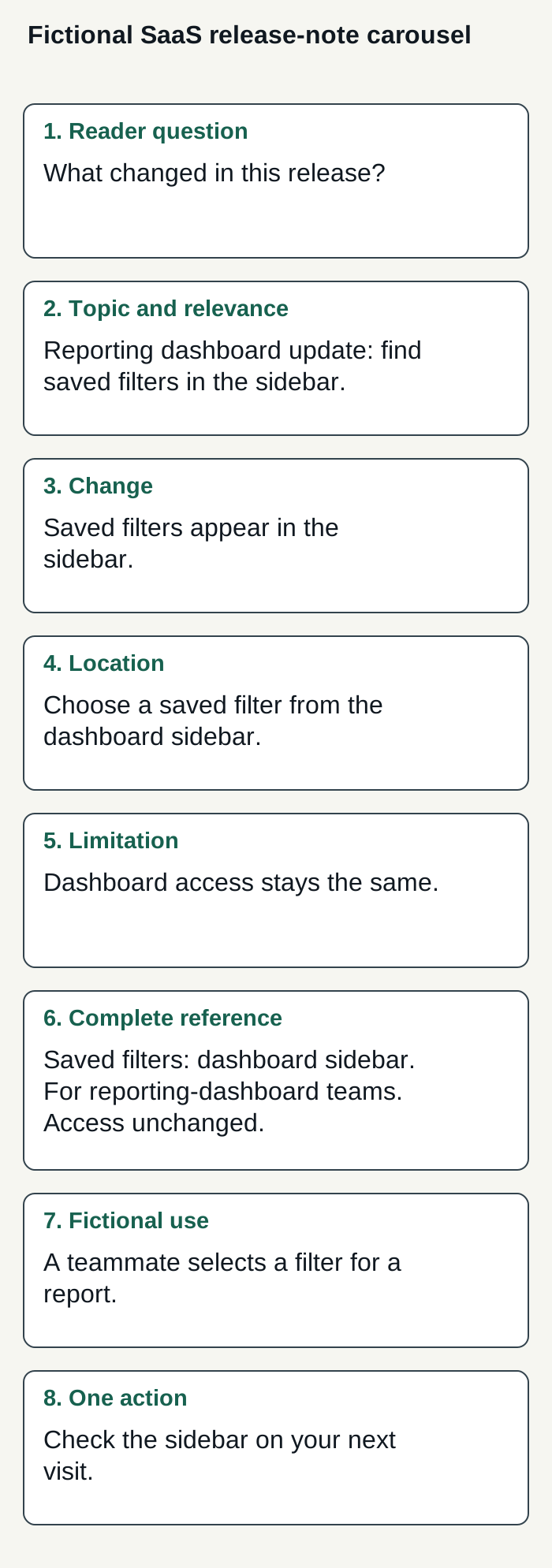
Original illustrative summary of the fictional eight-slide product-update example. It depicts no real product screen, Superdirector feature, customer or result.
Condensed original editorial illustration. Read the surrounding guidance for qualifications and the complete procedure; any example is fictional and shows no verified customer outcome or product screen.
Illustrative worked example by Superdirector editorial team. Created 2026-11-09.
Check the draft and run a bounded comparison
- Cover: does it describe what the carousel actually delivers?
- Slide 2: is the subject understandable without the cover?
- Sequence: does every frame add a useful point?
- Evidence: are factual claims supported and hypothetical examples labeled?
- Readability: is the text legible at its intended display size, with enough contrast?
- Takeaway: is the promised checklist or example complete?
- Publishing: do the exact media, order and caption meet your current publishing route’s requirements?
Choose one editorial question for a small batch of comparable posts. For example, compare a slide 2 that defines the problem with one that previews the checklist. Keep the audience, topic type and general design as similar as practical. Record which version ran and the available reach, saves and shares over the same observation window.
If reach is available and comparable, saves divided by accounts reached is a descriptive save rate: record both counts so a small denominator stays visible. The result is an account-specific observation, with topic, timing and audience differences still possible. It is not a randomized causal finding or a last-slide completion measure. Use it to decide what to try next.
Delegate the channel while keeping the goal clear
For this carousel task, the buying goal may be a customizable AI-run channel around $200 a month, operated toward useful business results—not a claim of current full autonomy or guaranteed results. Growth is currently $199/month for two accounts, with no trial. It can publish eligible Instagram image carousels and single X text posts, either with per-piece approval or an enabled account Auto-post rule; finished-video publishing and fully autonomous channels are upcoming. AI credit use varies by task. Check current pricing.
Publishing depends on connecting an account and selecting the source cards that can feed it. Before enabling Auto-post, approve the account’s first post by hand and verify it is live; turn Auto-post off to stop unsent work, or pause posting to hold the queue. See the publishing guide. For a carousel workflow, assess whether the drafts deliver the promised takeaway, then measure your review effort and customer-defined results in your own use.