How-To Guide
Explain a date-scheduling app in 15 seconds without hiding user control
Use three timed storyboards to explain a date-scheduling app while distinguishing a proposal, a pending reply and mutual confirmation.
How do I explain a dating app that schedules a date instead of letting people chat forever in a 15-second launch video?
Show the decision sequence, not a fantasy date: a person reviews a suggestion, chooses an available time and confirms only when they are ready. A 15-second launch video can make that interaction understandable if it focuses on one question. It cannot establish that your app creates better dates, removes safety risks or books anything automatically unless the real product demonstrably does so.
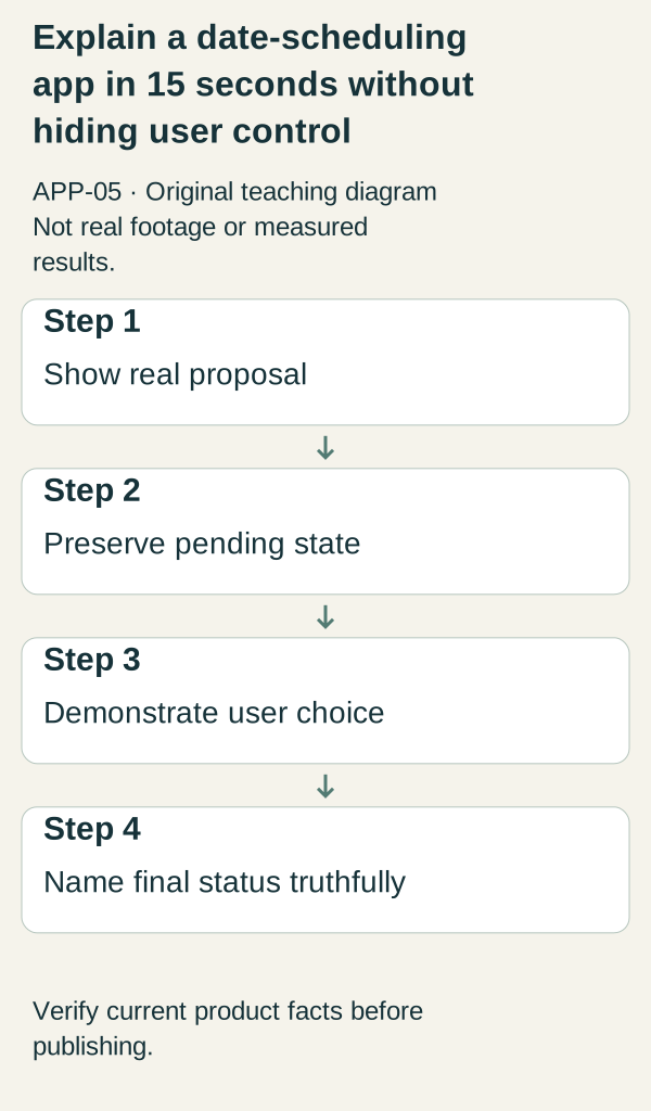
Original illustrative teaching diagram. Demonstrate a real proposed date, its pending state, user choice and truthful final status. This is planning guidance, not product footage, customer evidence or measured results.
Show the decision sequence, not a fantasy date: a person reviews a suggestion, chooses an available time and confirms only when they are ready. A 15-second launch video can make that interaction understandable if it focuses on one question. It cannot establish that your app creates better dates, removes safety risks or books anything automatically unless the real product demonstrably does so.
 Superdirector
Make it work for your brand
Find it. Remake it. Post it. Superdirector turns the viral formats in your niche into your brand's carousels, X posts and video scripts, and keeps the calendar full.
Write the product contract in one sentence
Before editing, complete this line: “The app helps [actual eligible audience] move from [real starting state] to [real scheduling state], while the user controls [actual decision].” If the product merely proposes a time, do not say it schedules a confirmed date. If a second person must agree, the video needs to show or explain that dependency.
The fictional app MeetAt is used here as a teaching device. Its assumed flow is proposal, review, mutual confirmation. These are not verified features of a released product. Adapt the scripts to your actual build and label all demonstration profiles. If there are no active members, add a persistent prototype or demo-data label and direct viewers to an honest waitlist rather than an unavailable matching experience.
A useful capture pack contains the starting screen, the proposal action, the other person’s decision state, the final status and the cancellation or change route. You do not need to fit every screen into one video, but you need them to avoid writing misleading shortcuts.
Storyboard one: “What happens instead of endless chat?”
Seconds 0–3: show a labeled demonstration conversation with the line “Ready to suggest a time?” Avoid mocking real conversations or implying that users owe anyone a meeting. The problem is an unclear next step, not a person declining to date.
Seconds 3–7: show the actual proposal action and available choices. On-screen text: “Choose a time to propose.” Use a fictional date and neutral demonstration venue only if the app actually includes venue selection. Do not add a calendar animation that implies a confirmed booking before anyone accepts.
Seconds 7–11: show the real pending state. Text: “A proposal is not a confirmation.” If the product has no separate pending screen, explain the actual dependency with a clearly editorial caption while preserving the real interface.
Seconds 11–15: show the true final state after the required acceptance action, using demo accounts. Text: “Both people decide.” Close with the product’s checked access route. If this sequence cannot be understood in 15 seconds, extend it; clarity is the requirement, not the stopwatch.
Storyboard two: “What if that time does not work?”
Seconds 0–3: open on a real proposal with “This time does not work for me.” Keep the names visibly fictional. This brief answers flexibility, not the initial concept.
Seconds 3–8: demonstrate the actual decline, alternative-time or change flow. Narration: “Here is the option the app gives me.” If the app only permits declining and starting again, show that honestly. Do not invent a polished rescheduling control in the editor.
Seconds 8–12: show the resulting status. Explain whether the other person receives a new proposal or whether nothing is scheduled. A visual arrow is an editorial aid, not proof of a notification being delivered. Do not claim delivery unless you have checked it.
Seconds 12–15: finish with “Check the available choices before accepting.” Use the actual app name and a factual access statement. This is not a promise that a declined time will lead to another invitation or a successful date.
Storyboard three: “Who is in control?”
Seconds 0–3: show “Does the app decide for me?” over a real demonstration screen. Do not use a fear-based setup or suggest that consent is merely an interface detail.
Seconds 3–7: show the user-controlled action that actually exists: reviewing a suggestion, choosing among options or confirming. Narration: “This step requires my choice.” If the product automates a different step, identify it precisely rather than saying everything is manual.
Seconds 7–11: show the real edit or cancellation route, if supported. Explain the immediate interface state and any verified consequence. Do not promise no fees, instant cancellation or automatic venue handling unless those facts are established for the actual service.
Seconds 11–15: end with “A scheduled plan still depends on the people involved.” Point to the current product explanation. This keeps the distinction between a software status and a real-world meeting visible.
Make the silent version understandable
Use short captions that name the state: proposed, awaiting response, confirmed, changed. Choose only terms that match the product. Avoid burying the distinction in voiceover while the screen says “date booked.” Test the clip with sound off and ask a viewer to identify what has and has not happened.
The commercial ShipTeaser script guide offers timed scene planning and a silent-first framework. It does not prove that exactly five scenes is optimal. The commercial FrameJam launch-teaser playbook demonstrates production planning and frame-level examples, not this dating flow or a conversion result. The three storyboards here are original, product-specific alternatives to a generic teaser template.
A capture and review checklist
For each export, write: real app version; demonstration-data label; starting state; user action; other-person dependency; final state; omitted time; destination checked. Keep the source recording. If processing or response time is shortened, label it so the edit does not imply an instantaneous interaction with another person.
Ask three comprehension questions rather than “Did you like it?”: Who chose the time? Is the plan already confirmed? What can a person do if they do not want it? Write down the answers before explaining the intended meaning. If the answers differ from the actual flow, revise the video.
Do not turn a tiny review into a performance statistic. A misunderstood pending state is a concrete editing problem; it does not establish a market-wide objection or predict acquisition.
Common errors and next action
The biggest errors are equating a suggestion with a booking, hiding mutual agreement, implying live local members through sample profiles and presenting cancellation as consequence-free without checking. A slick animation makes these errors harder to notice, not less consequential.
Start by recording the full proposal-to-status sequence from your current build. Write its actual states on separate cards. Then choose the one storyboard that answers the most important unresolved question and edit only after the states are accurate.