How-To Guide
How do you make an Instagram carousel that people swipe through?
Pick one idea, hook on slide one, give every slide one job, end on a slide worth saving, size it at 1080 x 1350 and post. With a ten-slide example.
By Bell Chen, founder of Superdirector — how the analysis works.
At a glance
How do you make an Instagram carousel that people swipe through?
Pick one idea that needs more than one picture, and give it a first slide that names the problem or the payoff in a few words. Give every middle slide a single job, build every slide at 1080 x 1350 pixels (4:5) so none is cropped to match slide 1, and finish on a slide people want to save or send to someone. Then post it from the Instagram app with the slides in order; you can reorder them later from Edit, but you cannot add a slide to a published carousel. People keep swiping when each slide answers the question the last one raised.
- Slide 1 wins the swipe; slide 2 has to make sense alone, because Instagram can show the post again starting from a later slide.
- One idea per slide, text you can read on a phone, the same fonts and colours throughout.
- The last slide asks for one thing: a save or a send.
The short answer: one job per slide
A carousel works when it reads like a short sequence. The first slide makes a promise, the middle slides pay it off one piece at a time, and the last slide gives the viewer a reason to keep the post. Each swipe should answer the question the previous slide raised. The table below is the plan this guide follows; the slide map and blank planning sheet are free to copy.
| Slide | Its job | What usually goes wrong |
|---|---|---|
| 1 | Stop the scroll: name the problem or the payoff | A logo or a vague title with nothing to find out |
| 2 | Say what the swipe gives them | Assumes the reader saw slide 1 |
| 3 to 7 | One step, point or example each | Two ideas squeezed onto one slide |
| 8 | Recap the whole thing on one screen | Missing, so there is nothing worth saving |
| 9 | Show proof, often your product doing one step | A sales pitch that breaks the sequence |
| 10 | Ask for one action: save it or send it | Three asks at once |
When enlarged, scroll horizontally to read the diagram.
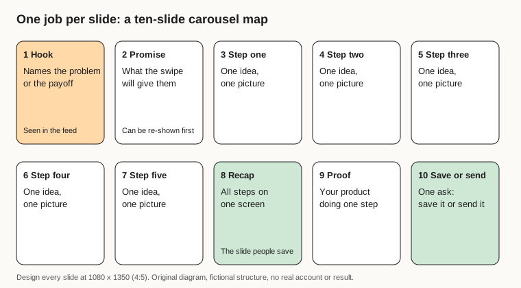
Original diagram of the ten-slide structure; no real account or result shown.
Original visual by Superdirector editorial team. Creation date not recorded.
Choose one idea that needs more than one picture
Start with the reason the post has to be a carousel at all. Good carousel ideas have a built-in order: steps, a ranked list, mistakes and their fixes, a before and after, a myth and the fact, or a product shown from several angles. If the idea fits on one image, post one image.
Teaching and list posts suit the format because people keep them. In Socialinsider's 2026 benchmarks, built from 67.5 million posts by 579,000 brand accounts and reporting 2025 data, carousels earned the most saves for brands above 10,000 followers in 2025. The same study found brands posted about 5 carousels a month against 8 Reels and 7 single images, so carousels were the least-posted of the three formats in that sample.
For a founder doing this alone, the easiest source of ideas is the questions customers already ask. A support reply that you have typed three times is a carousel: the question goes on slide 1, the answer becomes the steps.
Write a first slide that earns the swipe
The first slide is the only one most people see. Instagram's 2023 ranking explainer says Feed looks most closely at how likely someone is to spend a few seconds on a post, comment, like, share it and tap the profile photo. A cover slide that makes someone stop for those few seconds is doing the ranking work.
- Name the problem in the reader's words: "Your soup goes bland by Wednesday".
- Or name the payoff with a number they can check: "3 dinners, 1 shopping list, 20 minutes".
- Keep it to about a dozen words in large type; it has to read at thumbnail size.
- Add a reason to swipe on the slide itself, such as a numbered list that starts on slide 3.
Then write slide 2 as if it were the cover. Buffer explains that when a follower does not swipe to the end, Instagram can show the carousel to that person again later, starting from the first slide they did not reach. For many people that is slide 2, so it needs its own headline. Our guide to writing scroll-stopping hooks has more opening lines to test.
Give every middle slide one job
Each middle slide carries one idea and one picture. When a slide needs two sentences to explain, split it into two slides. Instagram allows up to 20 items in one carousel, according to its own publishing documentation, so there is no reason to cram.
- Put the step number or point number in the same corner on every slide.
- Use one font family, two sizes at most, and your brand colours on every slide.
- Keep body text short enough to read without zooming; a screenshot of your phone is the quickest test.
- End each slide on an unfinished thought only when the next slide finishes it; a cliffhanger on every slide gets tiring.
Length follows the idea. A five-step method needs about seven or eight slides with the cover and recap; a twenty-item product range can use all twenty. Socialinsider found carousels that mix photos and video averaged a 2.33% engagement rate in its study, as Agorapulse reports, so a short clip of the product in use is worth adding where it helps. A Reel itself cannot go inside a carousel: Instagram's media reference says Reels cannot appear in carousels.
End on a slide people save or send
The last two slides decide whether the post keeps working after today. Instagram's ranking explainer says the most important actions it predicts in Explore are likes, saves and shares. Buffer reports Adam Mosseri naming watch time, likes per reach and sends per reach as the signals that count most, with sends mattering slightly more for reaching people who do not follow you.
- Slide 8, the recap: every step on one screen, laid out like a checklist. This is the slide people save.
- Slide 9, the proof: your product doing one of the steps, a real screenshot or photo, no claims it cannot back.
- Slide 10, the ask: one action. "Save this for Sunday" or "Send this to whoever does the shopping".
Pick one ask. A last slide that says save, share, comment, follow and visit the link reads as a checklist of favours, and people do none of them.
Size and order the slides before you upload
Make every slide 1080 pixels wide and 1350 tall. That portrait shape is the tallest that Instagram's image specification for published posts allows: nothing taller than 4:5 or wider than 1.91:1. The table is the short version.
| Shape | Size to export | Use it for |
|---|---|---|
| Portrait 4:5 | 1080 x 1350 px | Almost every carousel |
| Square 1:1 | 1080 x 1080 px | Older templates and product grids |
| Landscape 1.91:1 | 1080 x 566 px | Wide charts or desktop screenshots only |
Pick the shape once, on slide 1. Instagram's publishing guide crops every later image to the first one, and a square is what you get if you do nothing. Get the set and the order right before you share. Instagram started letting people reorder slides after posting in March 2026, 9to5Mac reported, but you still cannot add a slide to a published carousel, so name the files 01, 02, 03 and so on, and pick them in that order.
Post it from the Instagram app
The in-app steps below follow Sprout Social's walkthrough; Instagram moves buttons now and then, so the labels may differ slightly on your phone.
- Tap the + button at the bottom of the screen and choose Post.
- Tap the multiple-selection icon and pick your slides in order, slide 1 first.
- Check every slide in the preview for cropping, then tap Next.
- Skip filters on designed slides; they shift your brand colours.
- Write the caption: the first line repeats the promise, the rest adds what did not fit on the slides.
- Add alt text, a short description of each slide for screen readers; Instagram lets you write it slide by slide.
- Tap Share, or open More options, turn on Schedule this post and pick a time.
If you post from a scheduling tool, check that it supports 20 slides and keeps their order; Storrito warns that some tools built for the old 10-slide limit reorder or drop slides. The 20-slide limit itself dates from August 2024, when, as MacRumors reported, Instagram doubled the old limit of 10.
A ten-slide worked example
Here is the whole method on one fictional brand. Plate & Plan is an invented meal-planning app run by one founder; the slides, wording and screenshots are illustrations, not a real account or a real result.
| Slide | Job | On-slide text | Picture |
|---|---|---|---|
| 1 | Hook | Stop throwing out half your groceries on Friday | A full fridge with a bin bag in the corner |
| 2 | Promise | 3 dinners, 1 shopping list, 20 minutes on Sunday | Three plates side by side |
| 3 | Step 1 | Pick 3 dinners that share 2 ingredients | Three recipe cards, shared items circled |
| 4 | Step 2 | Check the fridge before you write anything | Open fridge, hand holding a half-used pepper |
| 5 | Step 3 | Write one list, grouped by aisle | Plate & Plan list screen (labelled as the app) |
| 6 | Step 4 | Prep the shared ingredient once | Chopped onions in one big tub |
| 7 | Step 5 | Make Thursday the leftovers night | A calendar with Thursday marked |
| 8 | Recap | The 5 steps on one card | A checklist with five ticks |
| 9 | Proof | Plate & Plan builds the list in step 3 for you | Real app screenshot, no numbers claimed |
| 10 | Ask | Send this to whoever does the shopping | Two phones, one sharing to the other |
Notice what the example leaves out: no claims about money saved, no follower counts, no "link in bio" until the caption. Every slide can be checked against the product, which is the test a founder should apply before posting anything.
Read the results after a week
Judge a carousel against your other carousels, not against your Reels. The formats do different jobs: Buffer's analysis of more than 4 million posts found Reels got 36% more reach than carousels, while carousels earned around 109% more engagement per person reached. (The same page also gives a 12% engagement edge for carousels, measured differently.) A carousel with fewer views but many saves can be the better post.
- Saves per 1,000 people reached: did the recap slide work?
- Shares and sends: did someone think of a friend?
- Profile visits and follows from the post: did the hook bring in new people?
- Where people stopped swiping, if your Insights show a per-slide breakdown.
Give each post a week, because Instagram can show a carousel to the same person again later. Then repeat the structure that worked with a new topic. If you plan a month at a time, our content calendar guide shows how to slot a weekly carousel next to your videos, and growing with Reels covers the other half of the mix.
Where Superdirector fits
Superdirector, the site you are reading, is our product. It watches the accounts, competitors, keywords and hashtags in your niche, picks the posts and formats that are taking off, and remakes them as carousels in your brand with the same hook and structure, from close to the original idea to fully original. On the Growth plan ($199 a month, two accounts) it posts Instagram carousels and single X text posts at a weekly pace you set, after your first approval or with standing Auto-post. AI video and full autopilot are coming soon. You stay the publisher: check each carousel's claims against your product and label AI content where a platform asks you to. See how it works.