How-To Guide
Write the exact promise behind a dating-app verification badge
A verification badge can say less than a viewer thinks it says.
A verification badge can say less than a viewer thinks it says. Before your dating app's first release, make the launch demonstration explain the check performed, not merely celebrate a checkmark. The useful deliverable is a badge scope card that the product owner can approve against the actual verification flow.
This guide proposes a communication and comprehension test. It does not audit a verification system, establish its accuracy, or certify anyone as safe. The examples are hypothetical and the worksheet is blank.
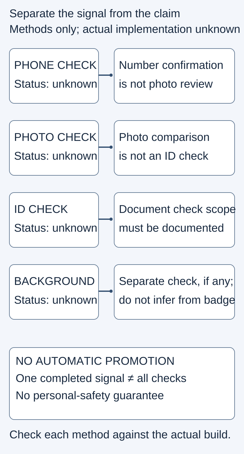
The diagram is an original planning aid. It contains no real profile, identity document, test result or verified-person endorsement.
 Superdirector
Make it work for your brand
Find it. Remake it. Post it. Superdirector turns the viral formats in your niche into your brand's carousels, X posts and video scripts, and keeps the calendar full.
Start with the method, not the icon
Write down the exact feature being demonstrated. A phone-number confirmation, photo comparison, identity-document check and background check are not interchangeable labels. If your app implements more than one method, keep their states distinct. Do not turn a completed check of one signal into a completed check of every signal.
Tinder's current Photo Verification explanation describes a video-selfie liveness and photo-likeness process. It explicitly says this does not guarantee a user's identity or safety, and describes other verification features separately. That is a useful example of a bounded claim, not evidence that your app uses the same process.
Bumble's photo verification guide, updated October 8, 2026, describes automated and human selfie-to-profile review. It also distinguishes mandatory verification in the USA from optional verification elsewhere, with safety-related exceptions. Do not borrow either its method or market rules without checking your own product.
Avoid a sweeping statement that no dating platform performs background checks. The narrower point is sufficient: a photo-only check does not establish that such a check occurred.
Build a three-part scope card
Put the card beside the badge in the product brief:
- Checked signal: what input was compared or confirmed, in this feature and build?
- Not established: which tempting interpretation would exceed the evidence?
- Next user control: where can someone inspect the explanation or use the app's actual reporting/help controls?
For example, a fictional app might use “Photo comparison completed” if that accurately describes its implementation. Its explanation would name the comparison and avoid suggesting identity or personal-safety clearance. This is sample copy to review, not an approved label for an uninspected app.
A second fictional app might show phone confirmation separately from photo review. The creator brief should preserve both labels and the unfinished state. A not-yet-reviewed profile is not an invitation to invent a negative conclusion about the person; it is simply a different product state.
Make the limitation survive the edit
Review the actual acquisition asset at its intended viewing size. A carefully qualified help page does not repair a short video that says “everyone is safe” while showing a badge. Keep the essential scope understandable in the same scene, not only in a distant caption or a frame viewers cannot read.
Write a shot list with three beats: the feature's name, the resulting status, and the accessible explanation. If the flow is optional in one launch market and required in another, make separate factual notes rather than cutting them into a universal sequence. If the current build is not available, storyboard the sequence and mark it unverified instead of presenting a mock screen as footage.
Use synthetic profiles or an authorized test environment. Do not upload real identity documents or collect biometric data just to create marketing evidence. Showing abstract profile shapes can explain the distinction without pretending a real person passed a check.
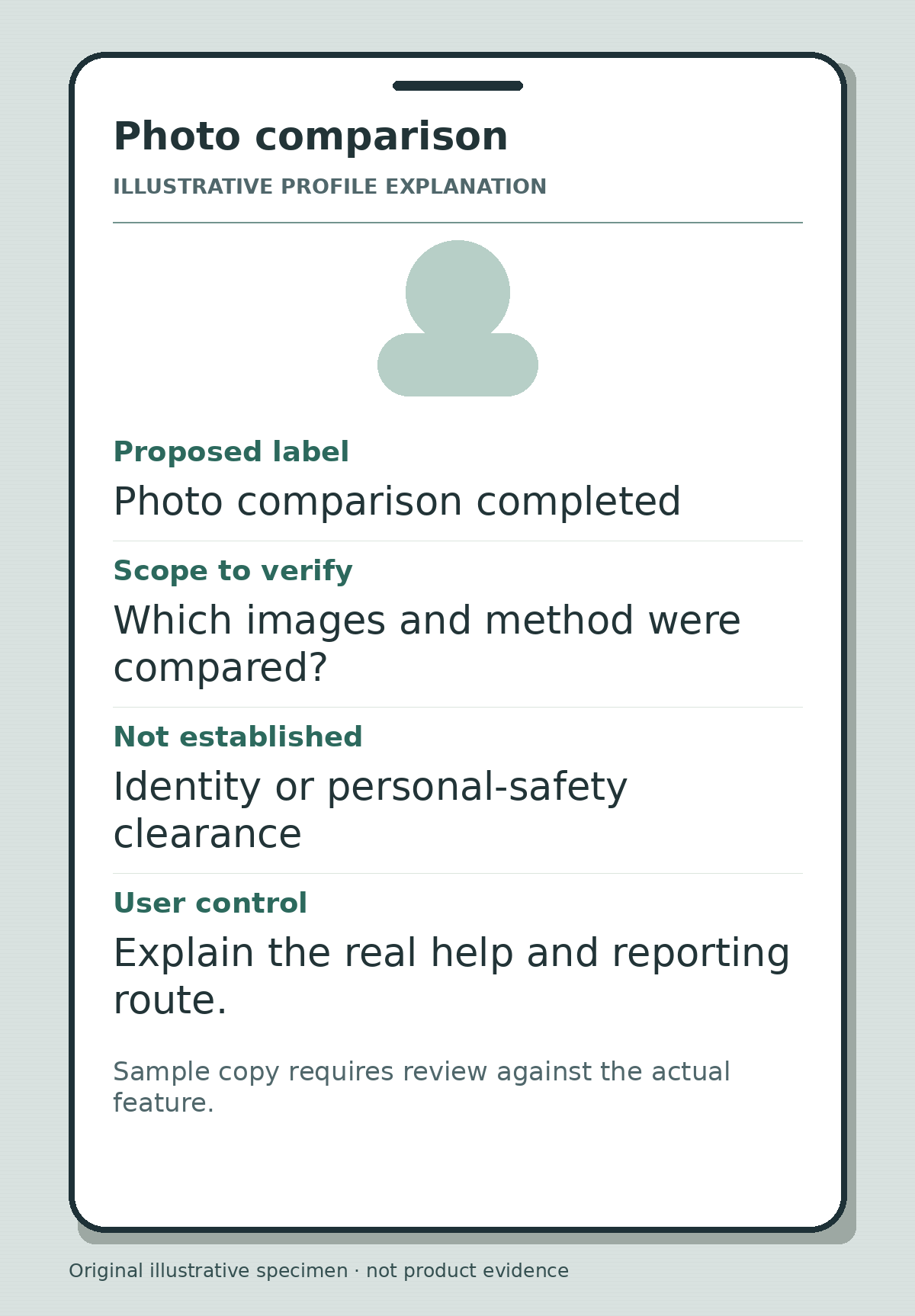
Original profile-explanation concept with no real person. “Photo comparison completed” is sample wording to verify against the actual implementation, not a verification result or safety endorsement.
Test interpretation without prompting the answer
Show the draft to a suitable reviewer and ask: “What do you think this badge tells you?” Then ask what it does not tell them. Record their own words before showing the intended scope card. If they infer an unperformed check, revise the label, placement or scene and test again. Do not count a person merely reading your disclaimer aloud as proof that the first impression was clear.
A recent public question asks about the reliability and identity implications of dating-app verification. That is one person's question, not a measured prevalence estimate or proof of any reply's technical allegations. It supports investigating the misunderstanding, not publishing an accuracy statistic.
Close the evidence loop before release
Use the blank verification worksheet to link each phrase to the current feature, market, build and owner. Record unresolved claims explicitly. Review the final landing-page, social crop and in-app explanation together so a shortened version does not quietly expand the promise.
After release, keep comprehension observations separate from clicks, signups and paid buyers. A clearer explanation may be a useful design outcome without proving higher conversion or lower risk. Validate the badge's scope against the actual implementation before using the explanation.